Matplotlib is a comprehensive library for creating static, animated, and interactive visualizations in Python.
In matplotlib, most plotting functions are accessed through the pyplot module.
Introduction
Matplotlib graphs your data on figures, each of which can contain one ore more Axes, an area where points can be specified in terms for x-y-z variables (or any other combination of variables, depending on dimension).
Creating a Figure
Easiest way to create a figure is to use pyplot.subplots. Then we can use Axes.plot to draw data on the Axes.
fig, ax = plt.subplots()        # Create a figure containing a single Axes.
ax.plot([1, 2, 3, 4], [1, 4, 2, 3])  # Plot some data on the Axes.
plt.show()                           # Show the figure.
The subplot method returns a Figure and an Array of Axes.
Parts of a Figure
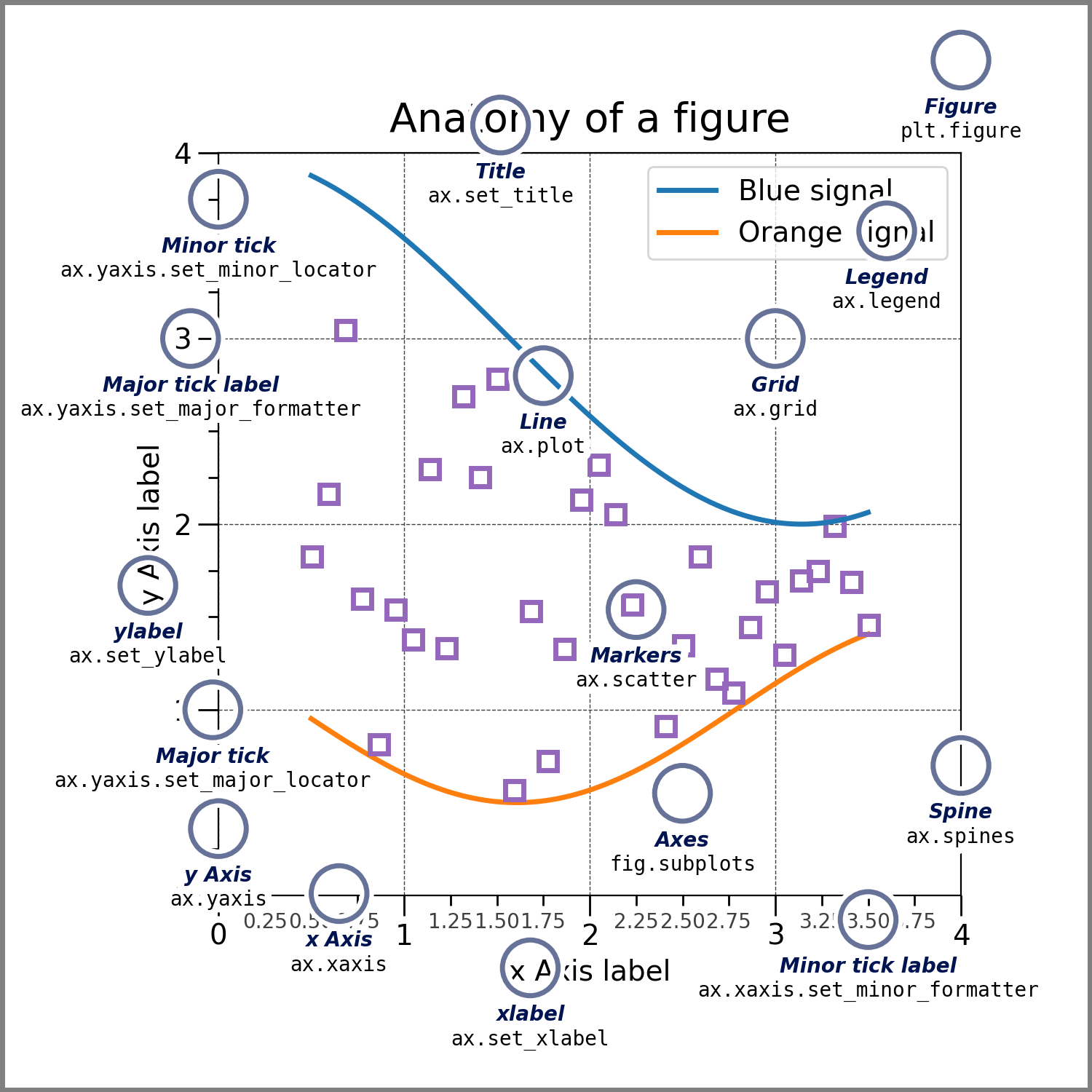 The whole figure. The Figure keeps track of all the child Axes a group of ‘special’ Artists (titles, figure legends, colorbars, etc.), and even nested subfigures.
fig = plt.figure()             # an empty figure with no Axes
fig, ax = plt.subplots()       # a figure with a single Axes
fig, axs = plt.subplots(2, 2)  # a figure with a 2x2 grid of Axes
# a figure with one Axes on the left, and two on the right:
fig, axs = plt.subplot_mosaic([['left', 'right_top'],
                               ['left', 'right_bottom']])
subplots() and subplot_mosaic are convenience functions that additionally create Axes objects inside the Figure, but you can also manually add Axes later on.
For more on Figures, including panning and zooming, see Figures.
Axes
An Axes is an Artist attached to a Figure that contains a region for plotting data, and usually includes two (or three in the case of 3D) Axis objects (be aware of the difference between Axes and Axis) that provide ticks and tick labels to provide scales for the data in the Axes. Each Axes also has a title (set via set_title()), an x-label (set via set_xlabel()), and a y-label set via set_ylabel()).
The Axes methods are the primary interface for configuring most parts of your plot (adding data, controlling axis scales and limits, adding labels etc.).
Axis
These objects set the scale and limits and generate ticks (the marks on the Axis) and ticklabels (strings labeling the ticks).
Artist
Basically, everything visible on the Figure is an Artist (even Figure, Axes, and Axis objects). This includes Text objects, Line2D objects, collections objects, Patch objects, etc. When the Figure is rendered, all of the Artists are drawn to the canvas. Most Artists are tied to an Axes; such an Artist cannot be shared by multiple Axes, or moved from one to another.
Plotting
We can generate a plot just by using plt.plot() if we give it a DataFrame.
plt.plot(df["data_column"])This automatically sets the index as the x-axis, and value partitions as y-axis.
You can add more arguments for different plotting styles.
plot(df['xlabel'], df['ylabel'], "go--", linewidth=2, markersize=12)"go--" represents a Format String.